Main Component Viewer

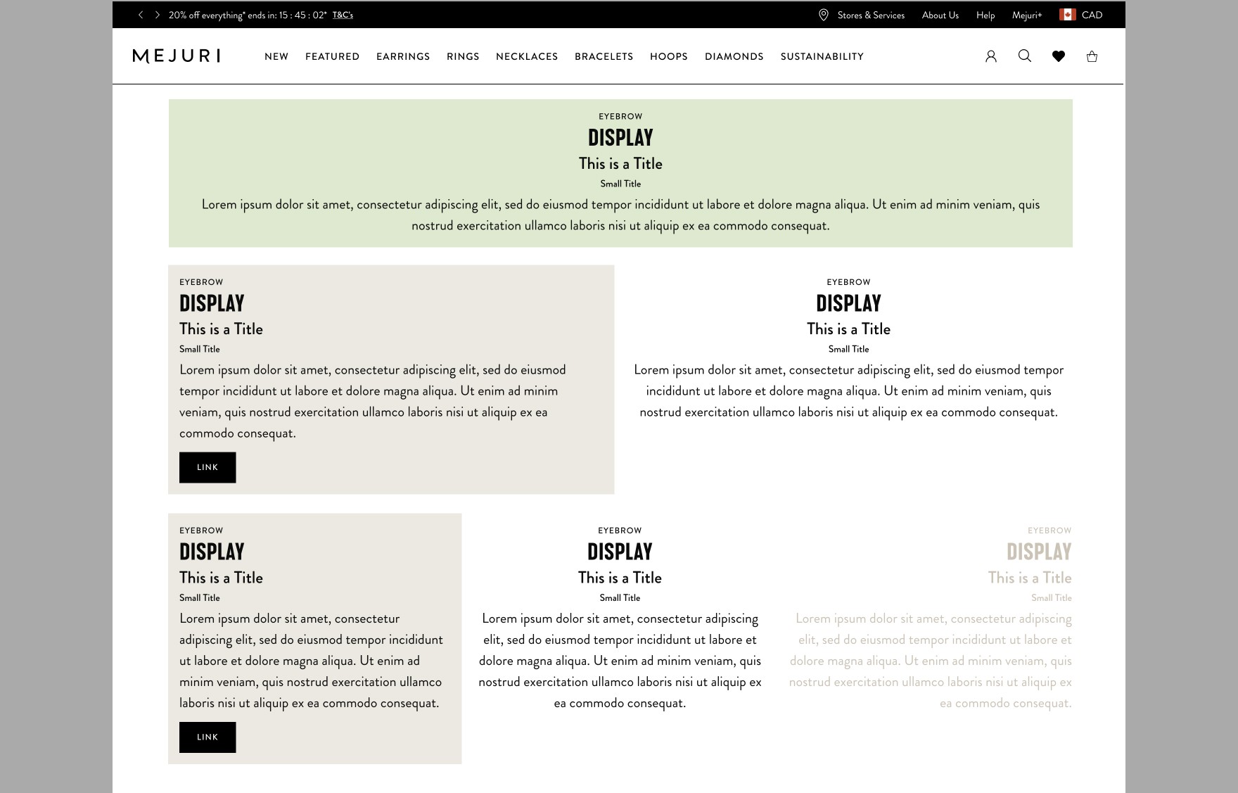
Typography Styles

Typography

Various Typography Styles in the Design System

Hero Components

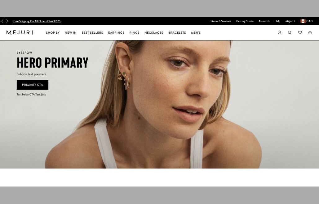
Hero Primary Full

A Full Screen Hero that supports Image, Video or Solid Coloured Background

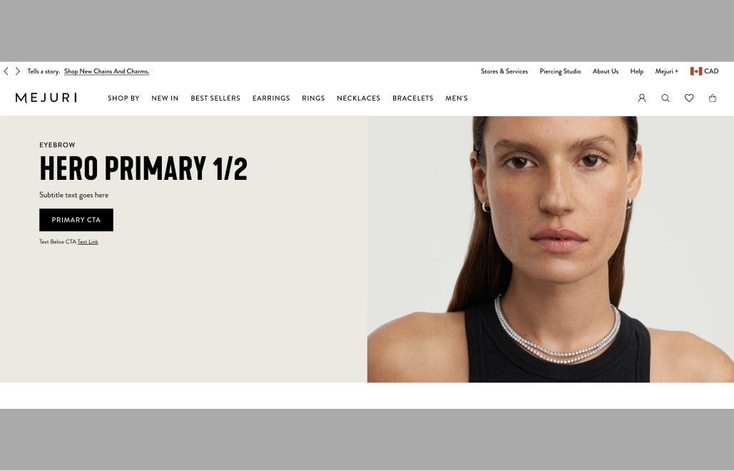
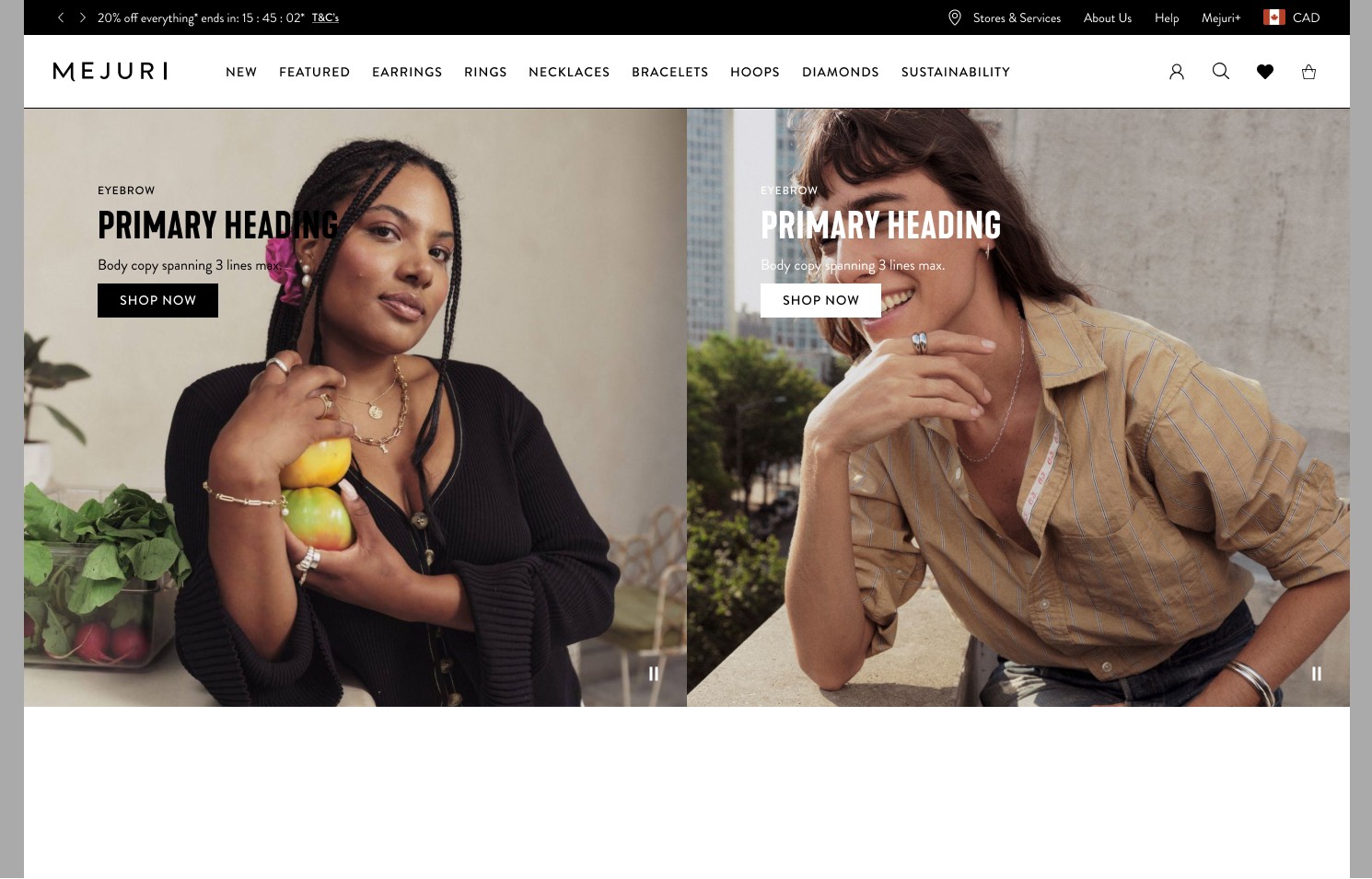
Hero Primary 1/2

A Half Screen Hero that supports Image, Video or Solid Coloured Background

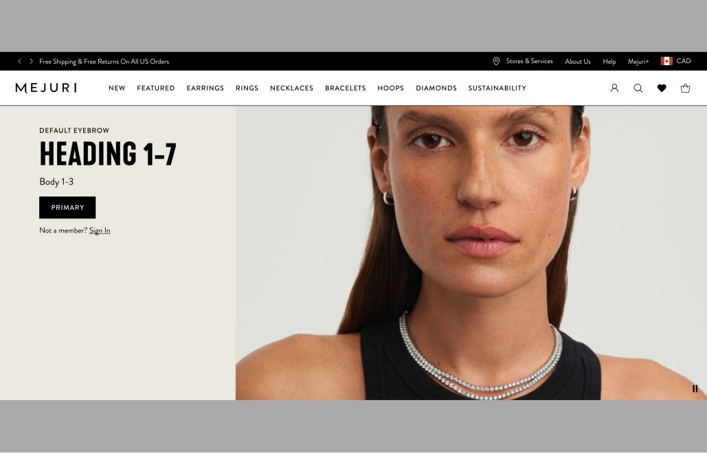
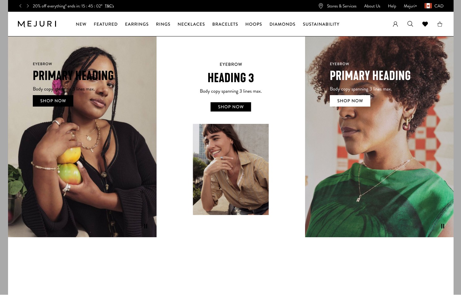
Hero Primary 2/3

A Half Screen Hero that supports Image, Video or Solid Coloured Background

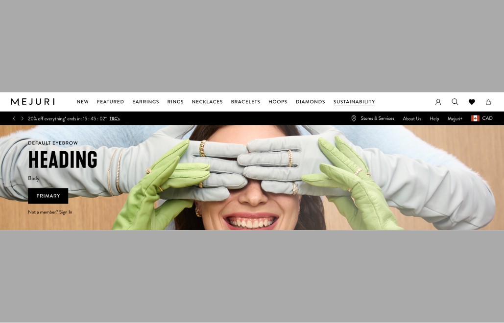
Hero Short

A Half Screen Hero that supports Image, Video or Solid Coloured Background

Side Kick Component

Side Kick 1/2

1/2 Side Kick that supports Full Bleed Image, Inset Card or Video

Side Kick 1/3

1/3 Side Kick that supports Full Bleed Image, Video or Solid Coloured Background

Content Card Components

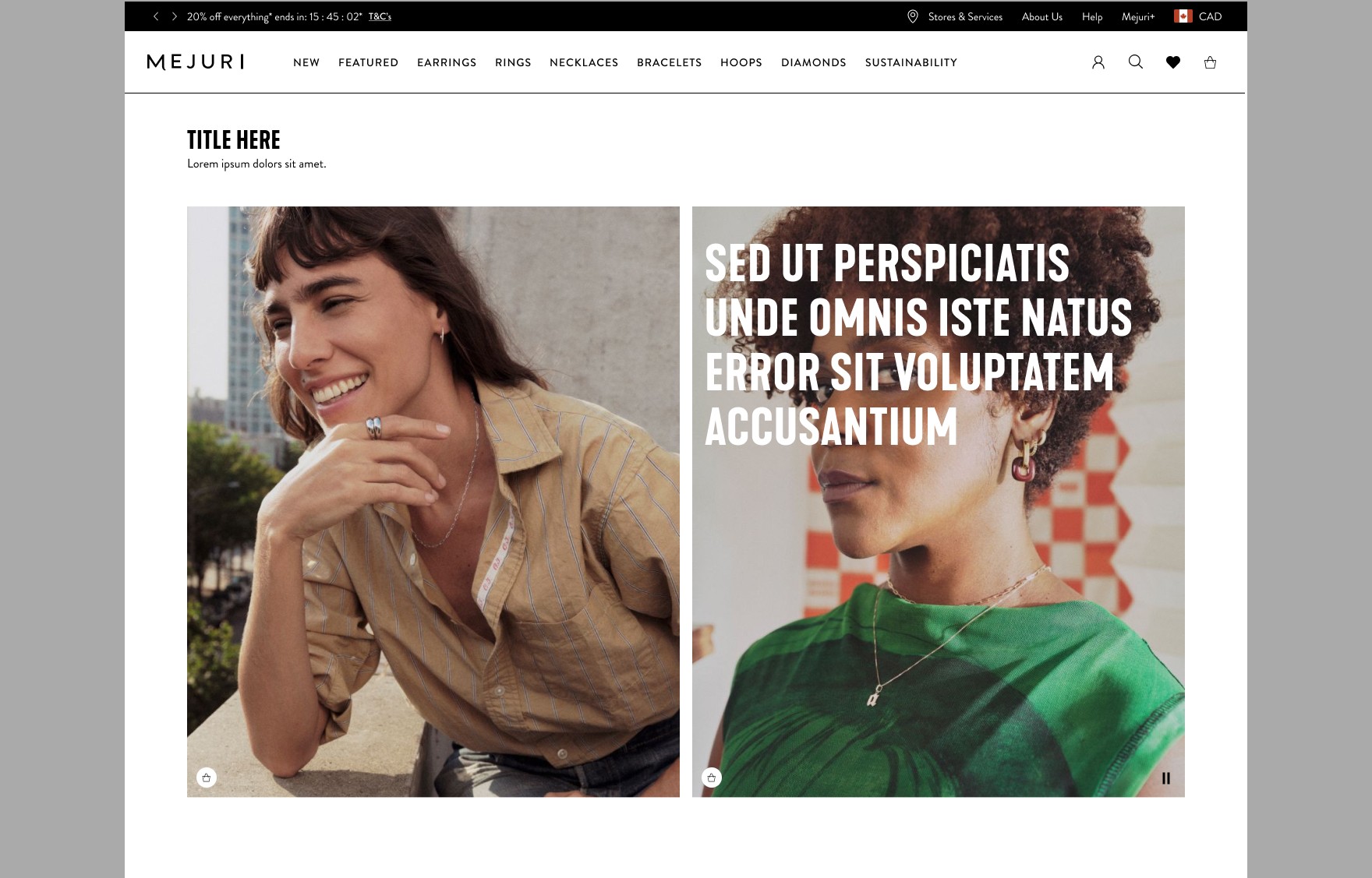
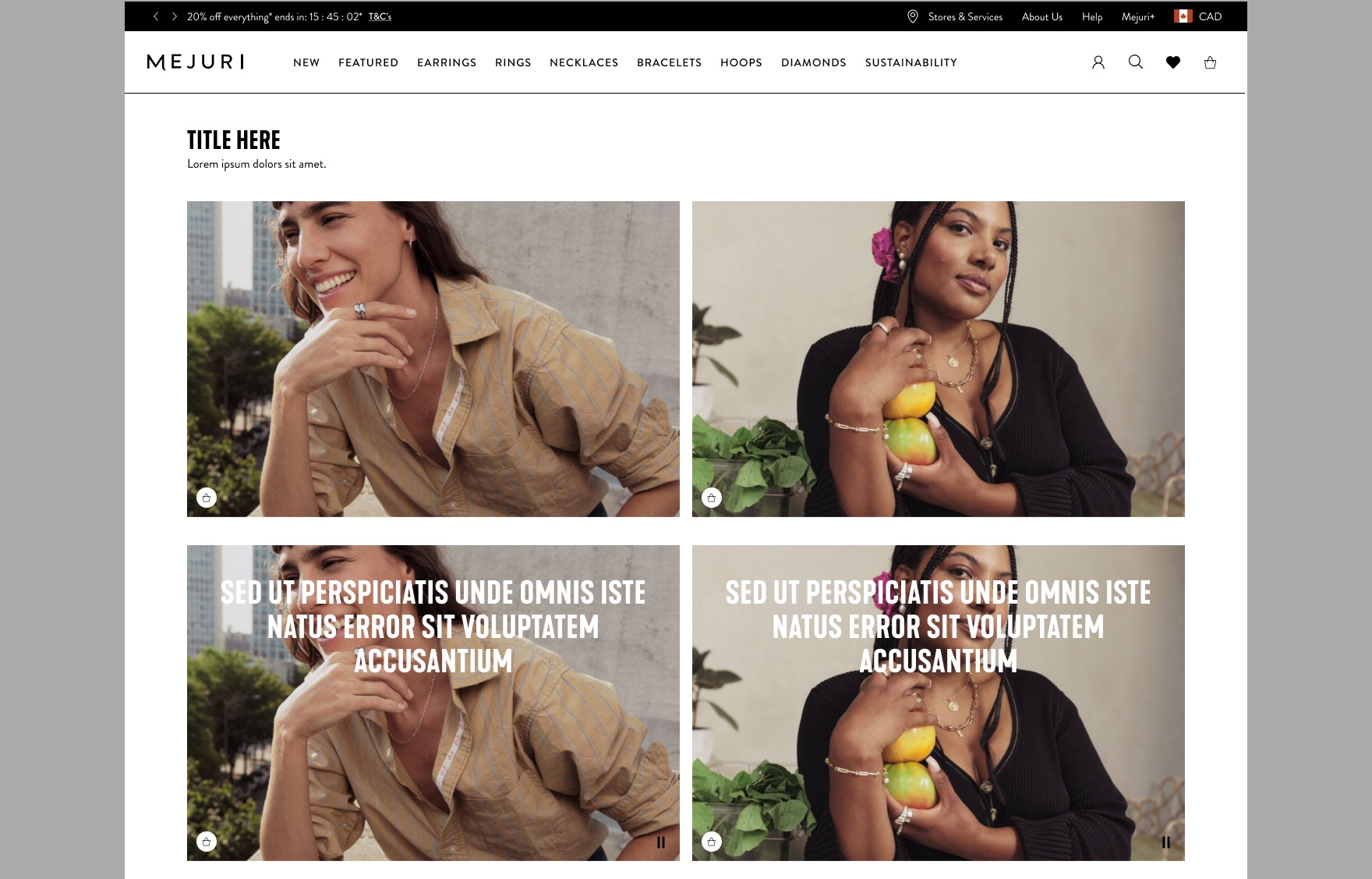
Vertical Content Card - Text Overlay or No Text

A Vertical Content Card that supports a vertical image, with or without text overlay.
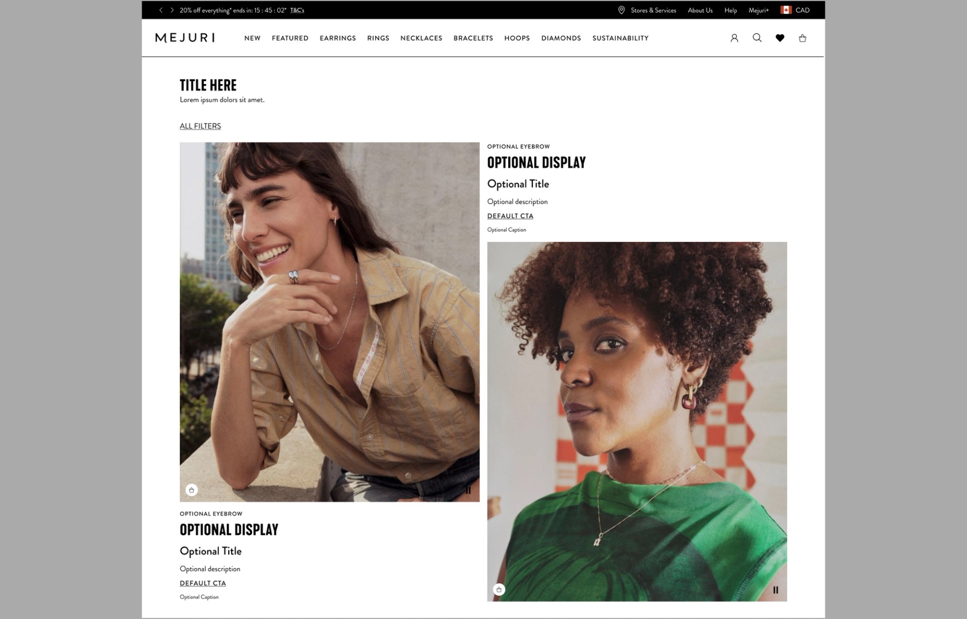
Horizontal Content Card - Text Overlay or No Text

A Horizontal Content Card that supports a vertical image, with or without text overlay
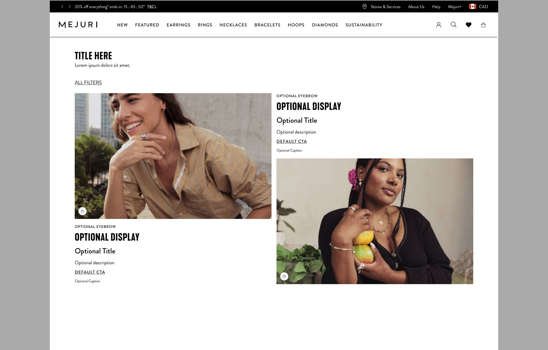
Vertical Content Card - Text Top or Bottom

A Vertical Content Card that supports a vertical image with text positioned at the top or bottom.
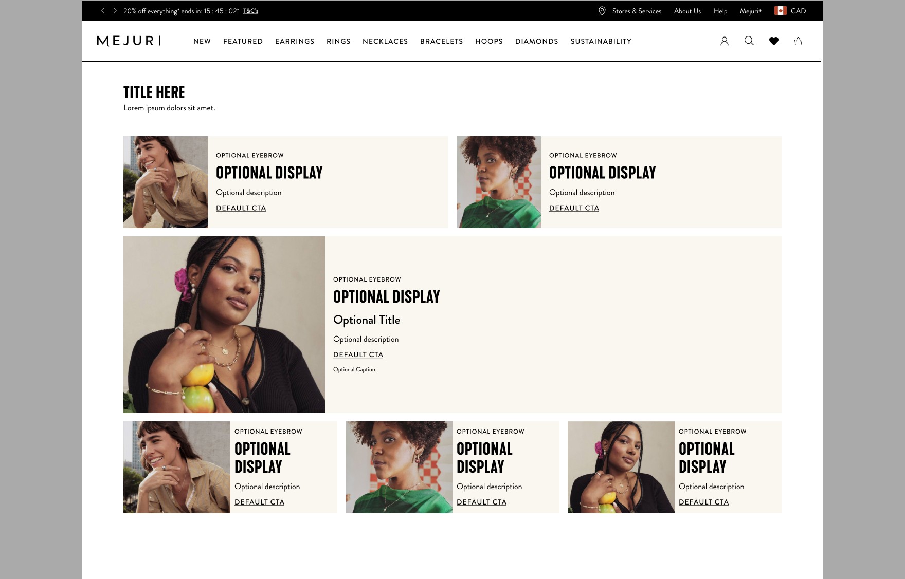
Horizontal Content Card - Text Top or Bottom

A Horizontal Content Card that supports a horizontal image with text positioned at the top or bottom.
Inline Content Card

An Inline Content Card that supports a square image with text.

Text Content Card

An Inline Content Card that supports a square image with text.

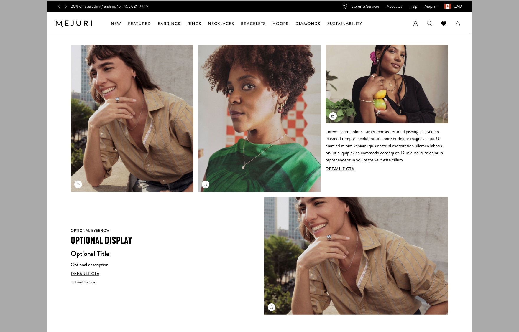
Mix and Match Content Card

A Mix and Match Content Card offers versatile layouts and styles.

Content Section Component

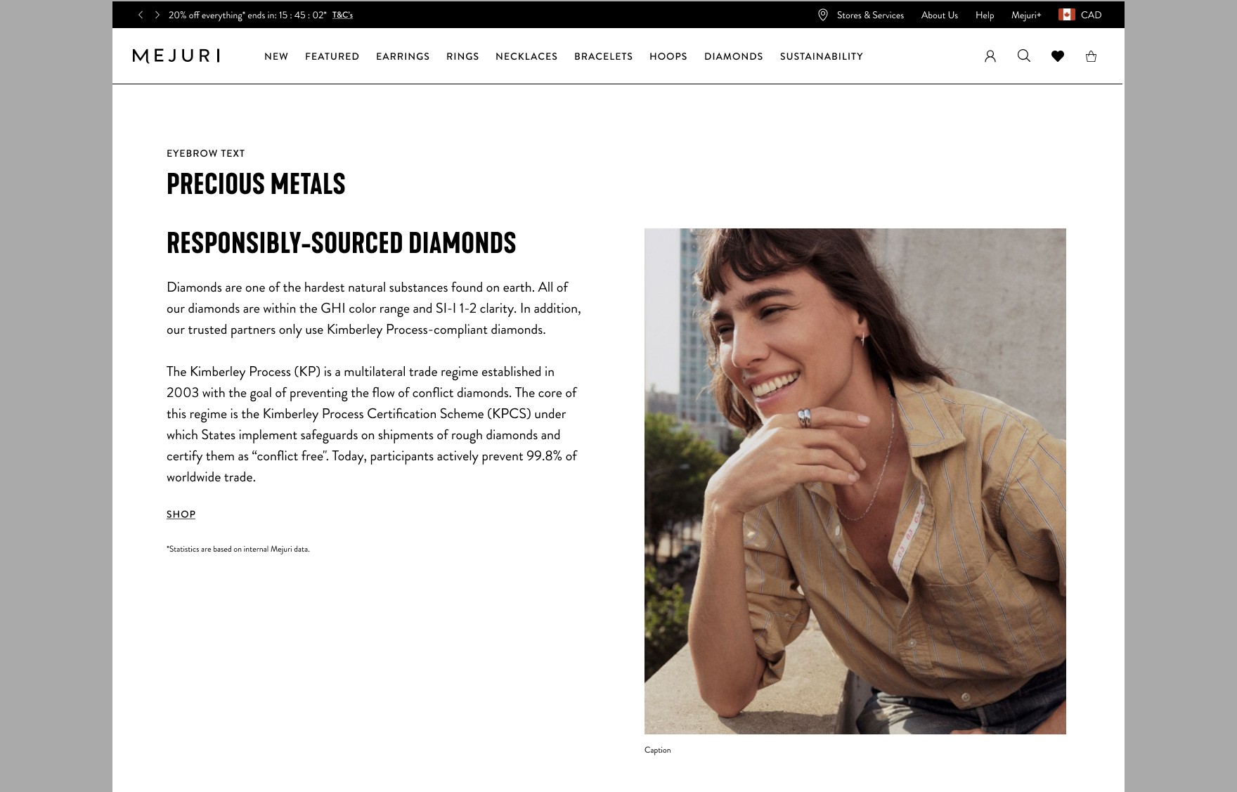
Content Section

A Content Section that features a vertical image with side-by-side content.

Image Navigation Components

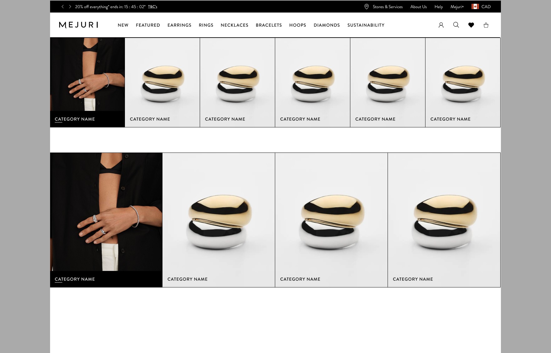
Category Image Navigation

An Image Card in a grid layout that serves as an entry point for various product categories.

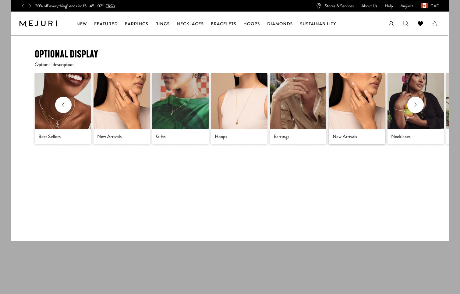
Sub-Category Image Navigation

An Image Card in a grid layout that serves as an entry point for various product categories.

Toolbar

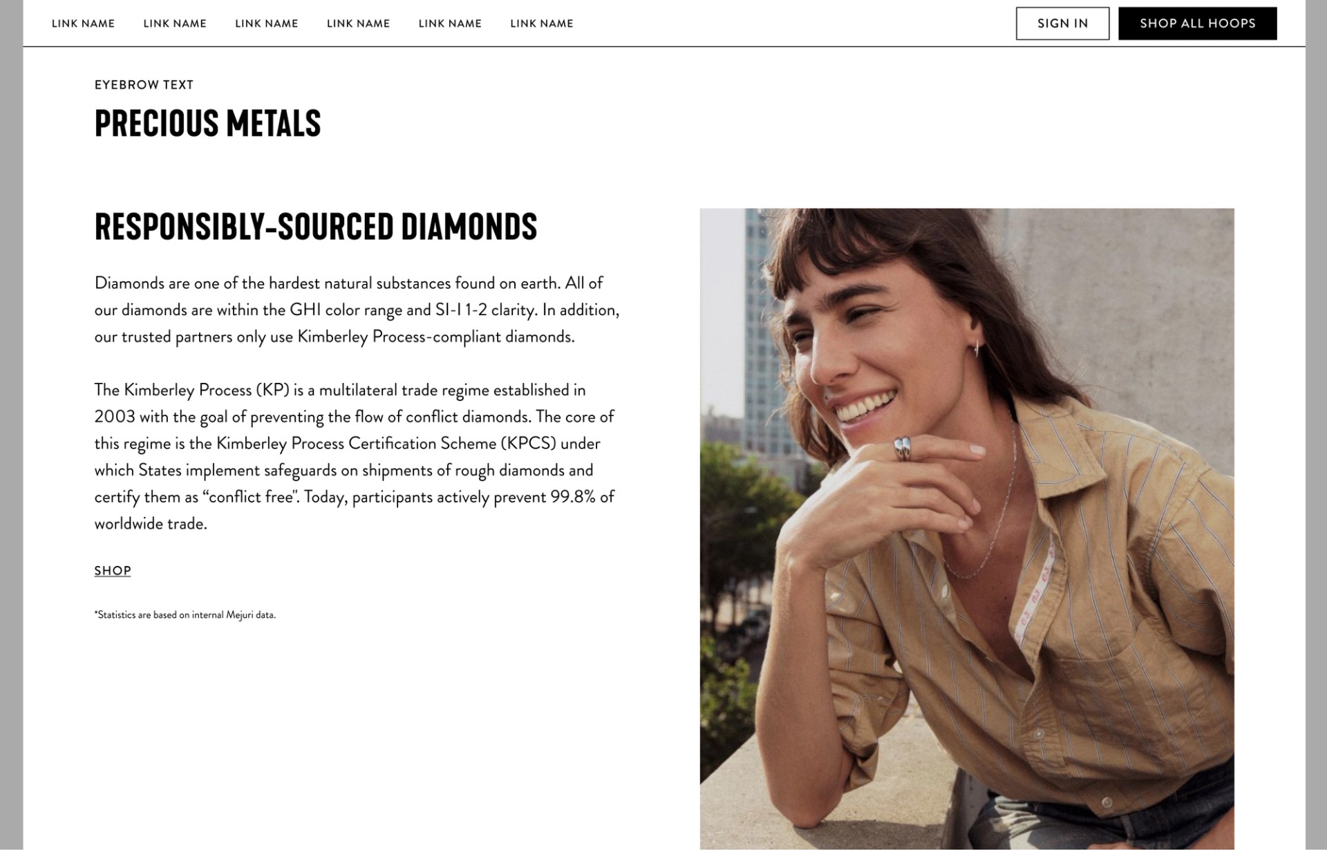
Toolbar

A component used to anchor users to a part of a long page, or as a sticky CTA to lead users to an adjacent page that will add value to their journey
Product Card Components

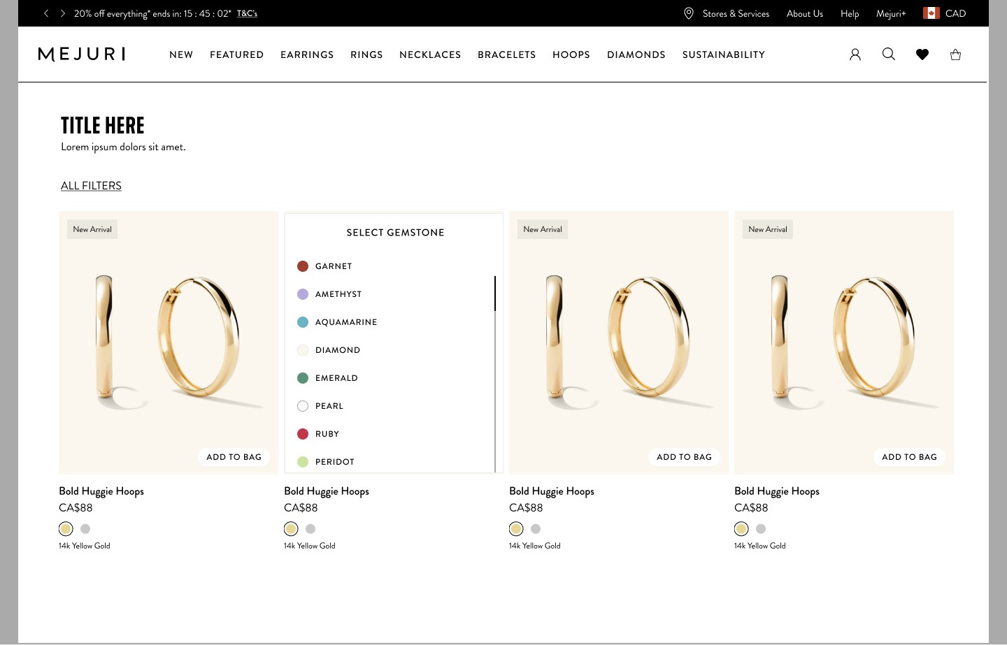
Product Card with Variation

A Product Card that displays key product information and includes a product variation selector

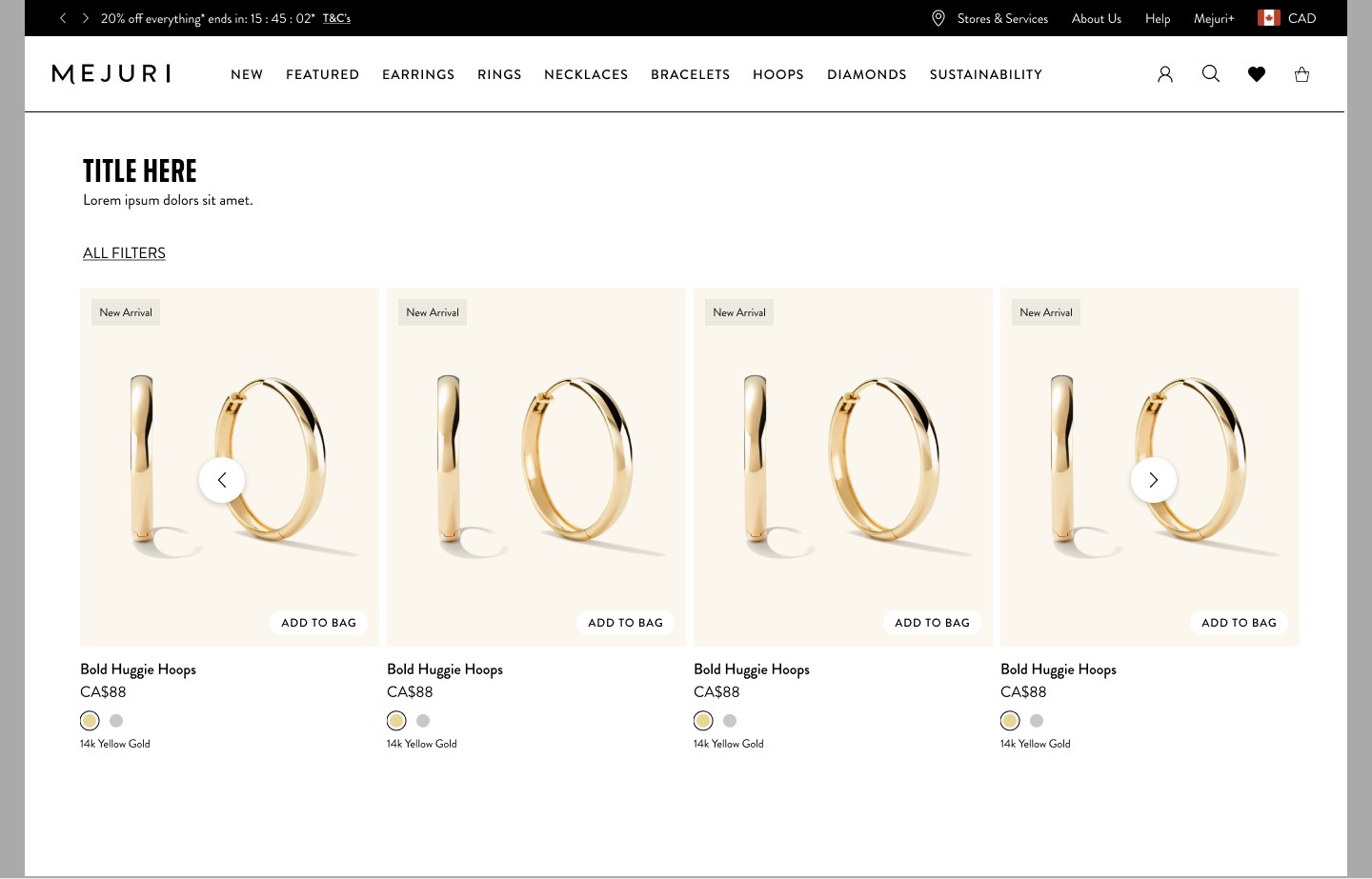
Product Card without Variation

A Product Card that provides key product information