
Hero Primary Full
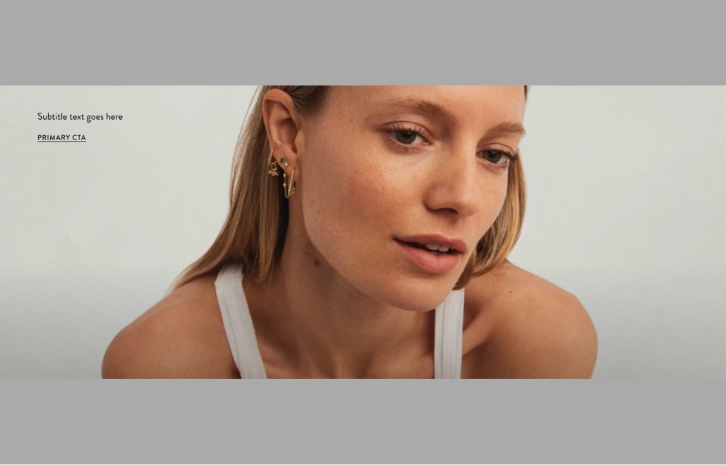
(Top Left Shown Above)
The Hero Can Support Video or Images. There can only be 1 Hero placed per page and appears at the top of the screen
Hero Primary Content Alignment Options
Content can be placed in a variety of different positions on the Hero. Text alignment can also vary (left, centered and right)
Ensure text meets accessibility contrast ratios when placing over images and backgrounds.
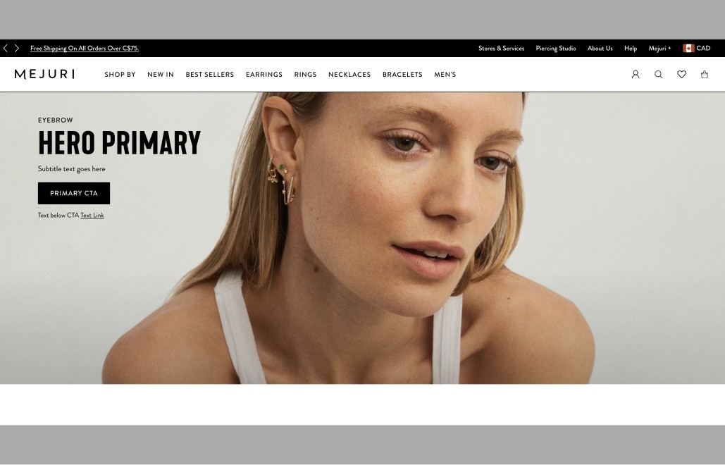
Hero Primary Full (Top Left)
Asset Layout= Background
Asset Type: Image
Asset Alignment - Not Applicable
Content Alignment - Top Left
Text Alignment - Left
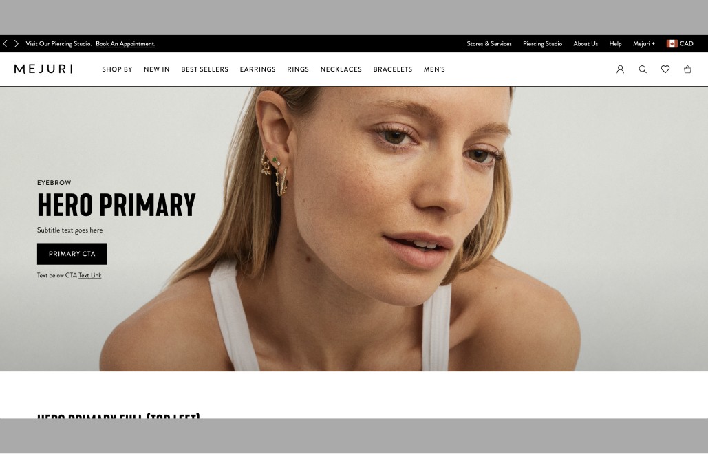
Hero Primary Full (Center Left)
Asset Layout= Background
Asset Type: Image
Asset Alignment - Not Applicable
Content Alignment - Center Left
Text Alignment - Left
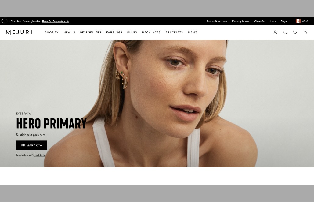
Hero Primary Full (Bottom Left)
Asset Layout= Background
Asset Type: Image
Asset Alignment - Not Applicable
Content Alignment - Bottom Left
Text Alignment - Left
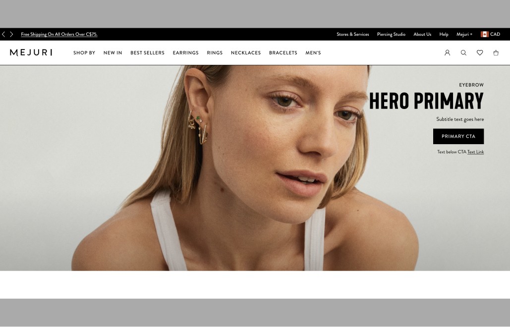
Hero Primary Full (Top Right)
Asset Layout= Background
Asset Type: Image
Asset Alignment - Not Applicable
Content Alignment - Top Right
Text Alignment - Right
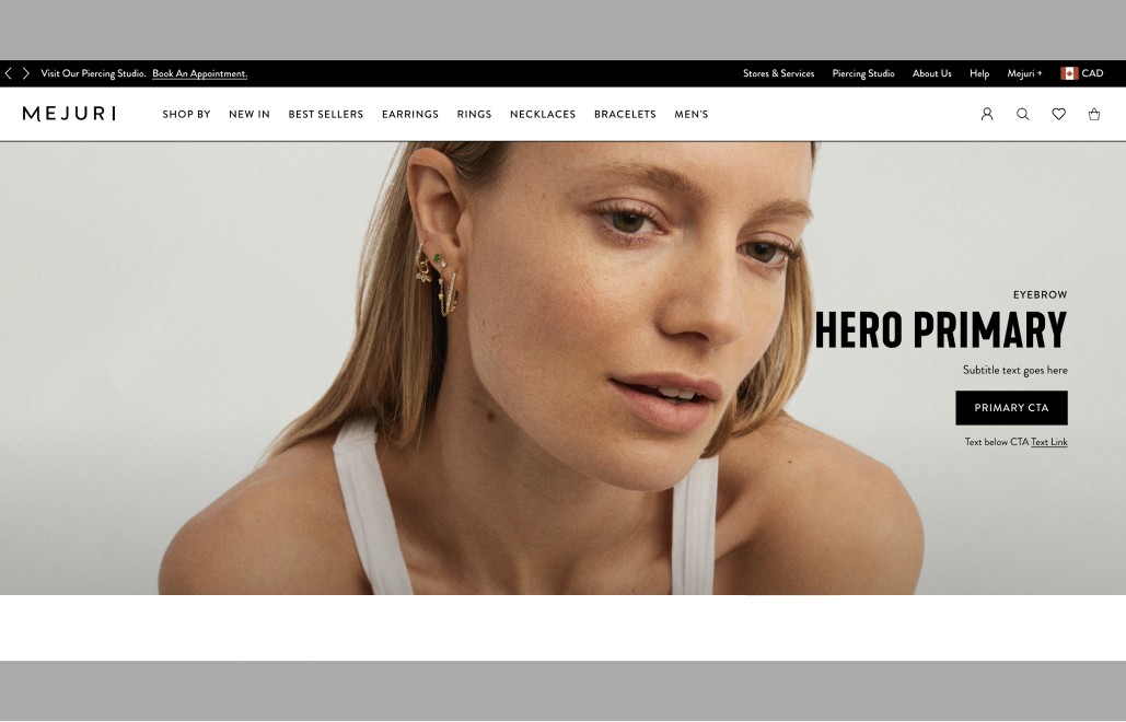
Hero Primary Full (Center Right)
Asset Layout= Background
Asset Type: Image
Asset Alignment - Not Applicable
Content Alignment - Center Right
Text Alignment - Right
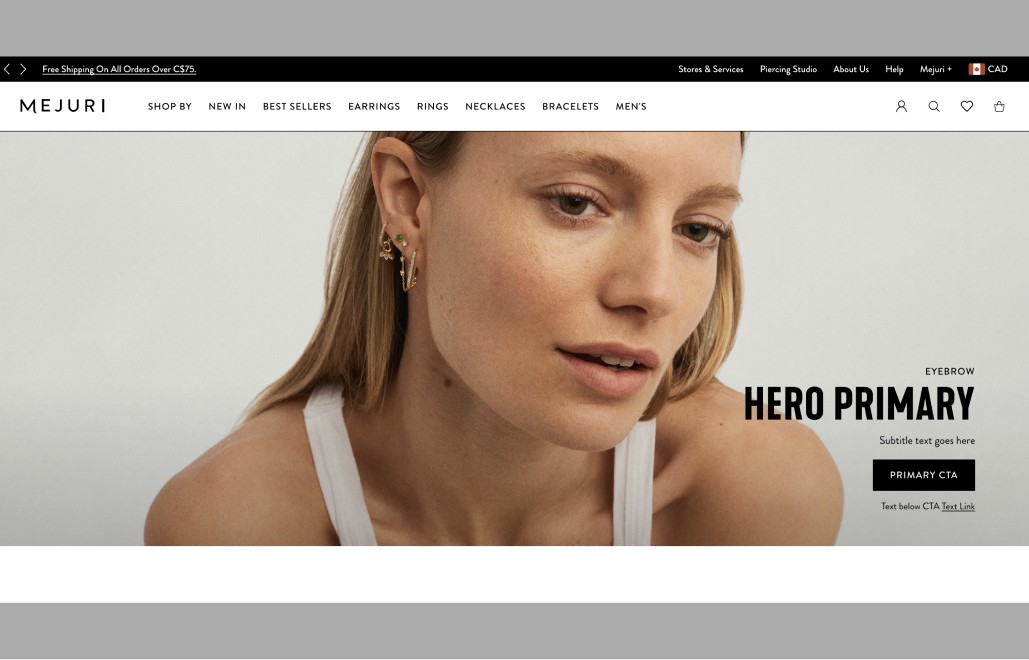
Hero Primary Full (Bottom Right)
Asset Layout= Background
Asset Type: Image
Asset Alignment - Not Applicable
Content Alignment - Bottom Right
Text Alignment - Right
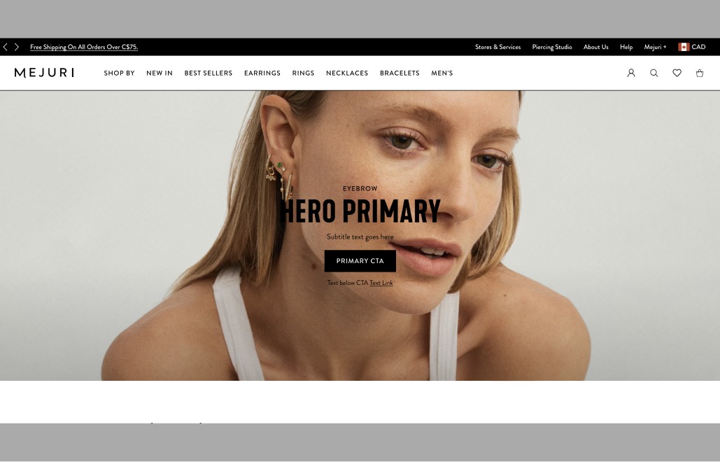
Hero Primary Full (Center Center)
Asset Layout= Background
Asset Type: Image
Asset Alignment - Not Applicable
Content Alignment - Center Center
Text Alignment - Centered
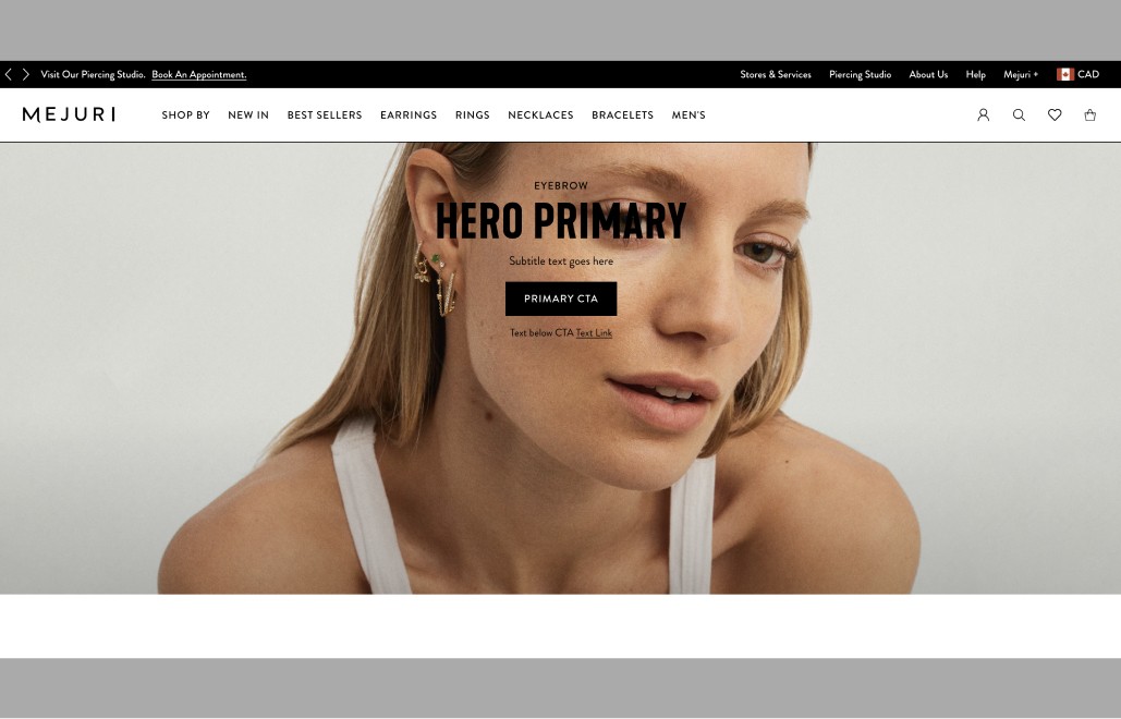
Hero Primary Full (Top Center)
Asset Layout= Background
Asset Type: Image
Asset Alignment - Not Applicable
Content Alignment - Top Center
Text Alignment - Centered
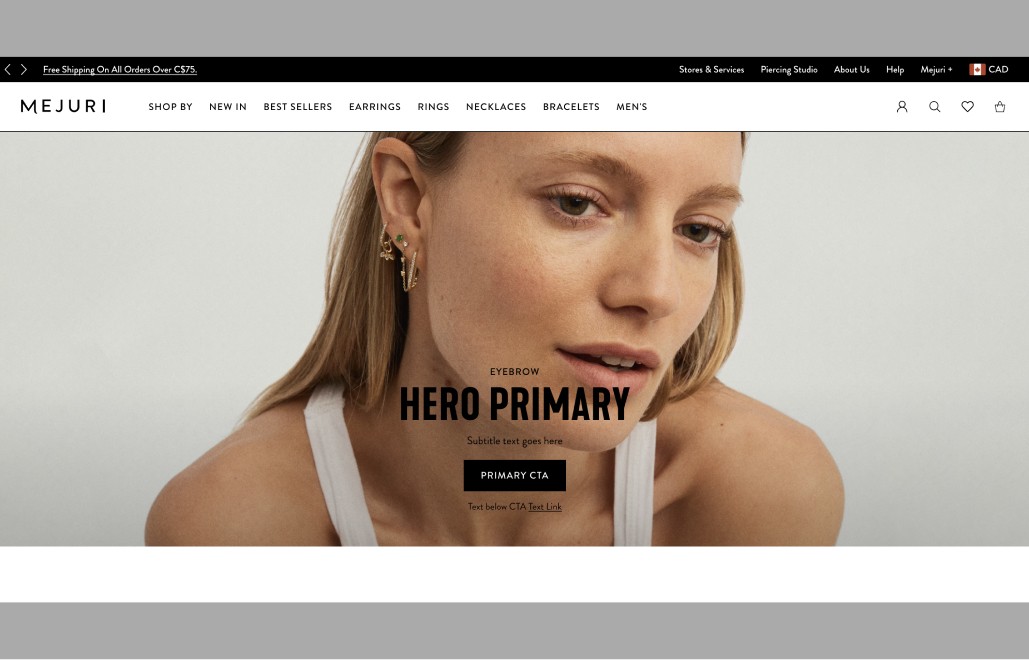
Hero Primary Full (Bottom Center)
Asset Layout= Background
Asset Type: Image
Asset Alignment - Not Applicable
Content Alignment - Bottom Center
Text Alignment - Centered
Button Styles
Various buttons and links can be used in the Hero Component
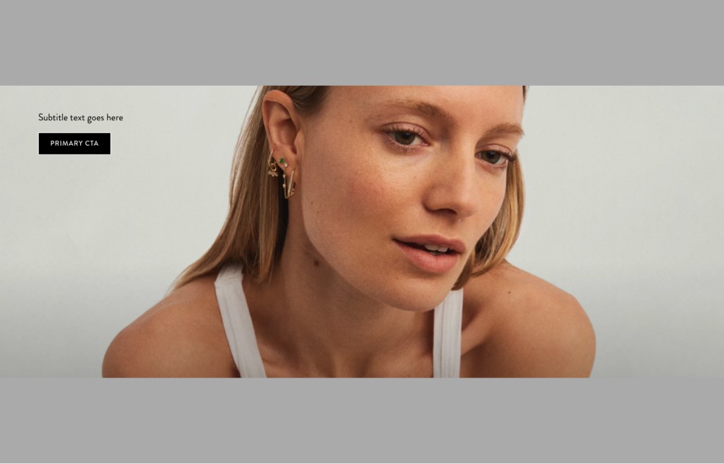
Primary Black BG
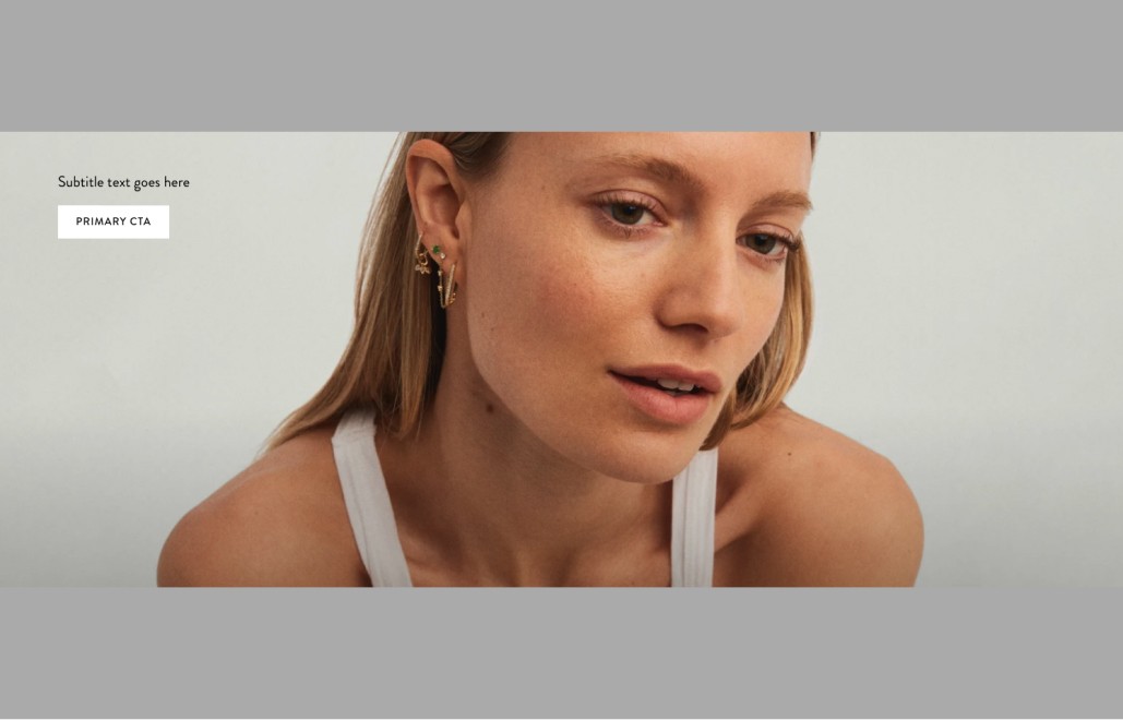
Primary White BG
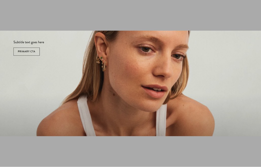
Primary Inverse
Primary Link

Secondary Link
