Image Navigation
(Shown Above 2,4,6 Cards )
The Image Navigation can be used for providing high level entry point such as product categories to the users.
Image Navigation Card Content Alignment
The Image Navigation Card only support title as a content. The title text is left aligned at the bottom of the card. For the hover state, black background has used.
Ensure text meets accessibility contrast ratios when placing over images and backgrounds.
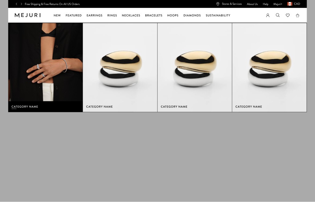
Image Navigation Content Desktop
Desktop Media Alignment: Full
Asset Layout= Background
Asset Type: Image
Asset Alignment - Not Applicable
Content Alignment - Bottom Left
Text Alignment - Left
Default State - Utility 1 - Brandon Grotesque / Medium / 14pt
Hover State - Utility 1 - Brandon Grotesque / Underlined/ Medium / 14pt on black background
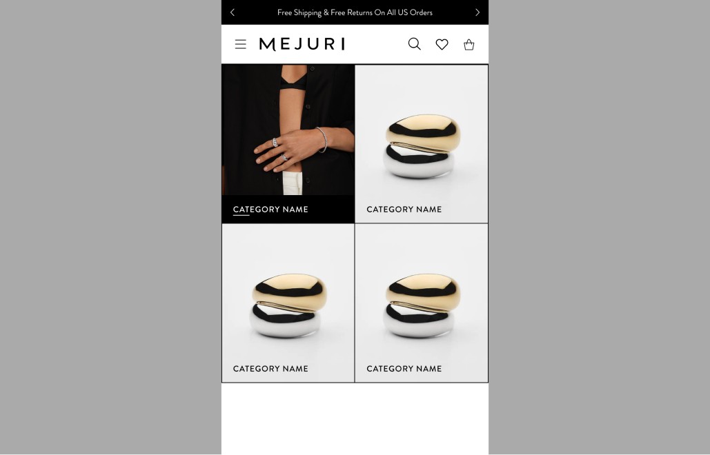
Image Navigation Content Mobile
Mobile Media Alignment: Full
Asset Layout= Background
Asset Type: Image
Asset Alignment - Not Applicable
Content Alignment - Bottom Left
Text Alignment - Left
Default State - Utility 1 - Brandon Grotesque / Medium / 14pt
Hover State - Utility 1 - Brandon Grotesque / Underlined/ Medium / 14pt on black background
Image Navigation Desktop and Mobile image Alignment
The Image Navigation Can Support Primary Image as Default State and Secondary Images as Hover State.
- •
The minimum number of image navigation - 2 cards
- •
The maximum number of image navigation - 6 cards
There are various vertical and horizontal spacing options.
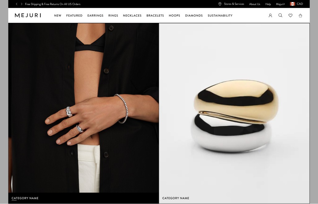
Image Navigation 2 Cards Desktop
Desktop Media Alignment: Full
Asset Layout= Background
Asset Type: Image
Asset Alignment - Not Applicable
Content Alignment - Bottom Left
Text Alignment - Left
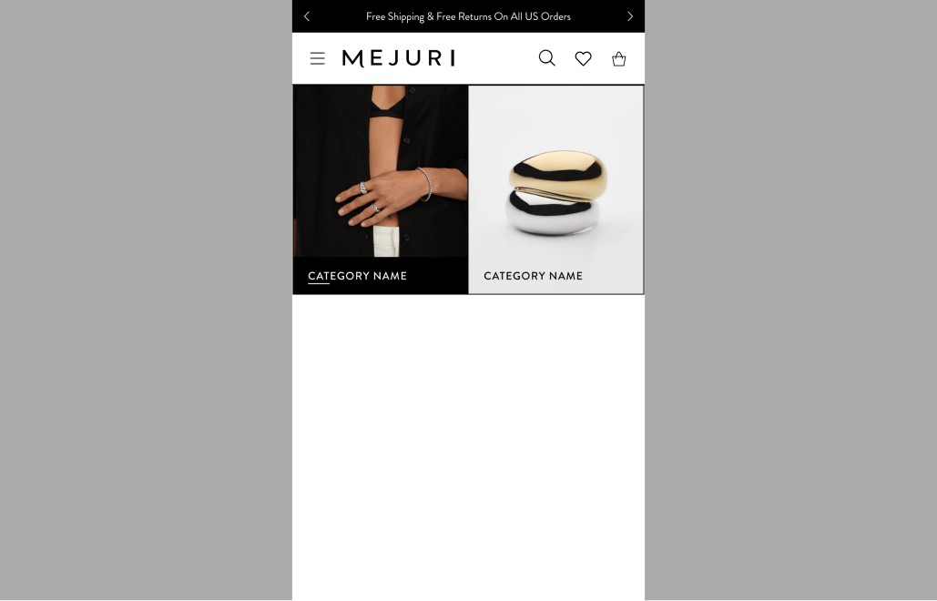
Image Navigation 2 Cards Mobile
Mobile Media Alignment: Full
Asset Layout= Background
Asset Type: Image
Asset Alignment - Not Applicable
Content Alignment - Bottom Left
Text Alignment - Left

Image Navigation 4 Cards Desktop
Desktop Media Alignment: Full
Asset Layout= Background
Asset Type: Image
Asset Alignment - Not Applicable
Content Alignment - Bottom Left
Text Alignment - Left

Image Navigation 4 Cards Mobile
Mobile Media Alignment: Full
Asset Layout= Background
Asset Type: Image
Asset Alignment - Not Applicable
Content Alignment - Bottom Left
Text Alignment - Left
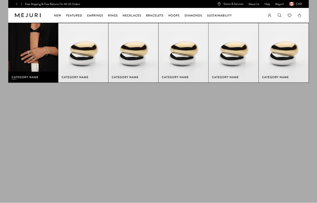
Image Navigation 6 Cards Desktop
Desktop Media Alignment: Full
Asset Layout= Background
Asset Type: Image
Asset Alignment - Not Applicable
Content Alignment - Bottom Left
Text Alignment - Left
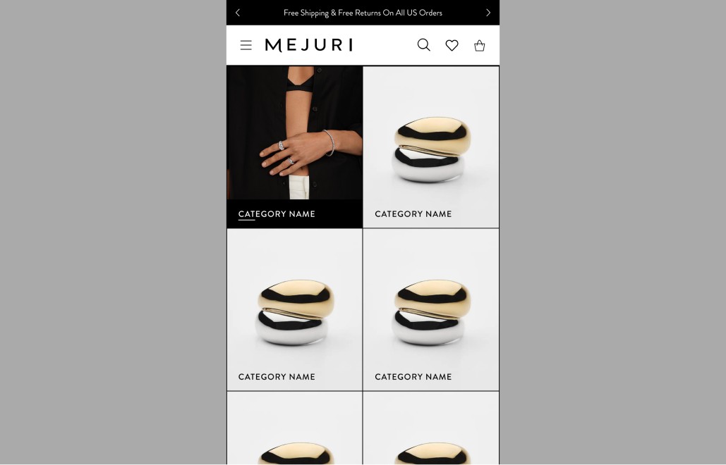
Image Navigation 6 Cards Mobile
Mobile Media Alignment: Full
Asset Layout= Background
Asset Type: Image
Asset Alignment - Not Applicable
Content Alignment - Bottom Left
Text Alignment - Left
Button Styles
Various buttons and links can be used in the Hero Component
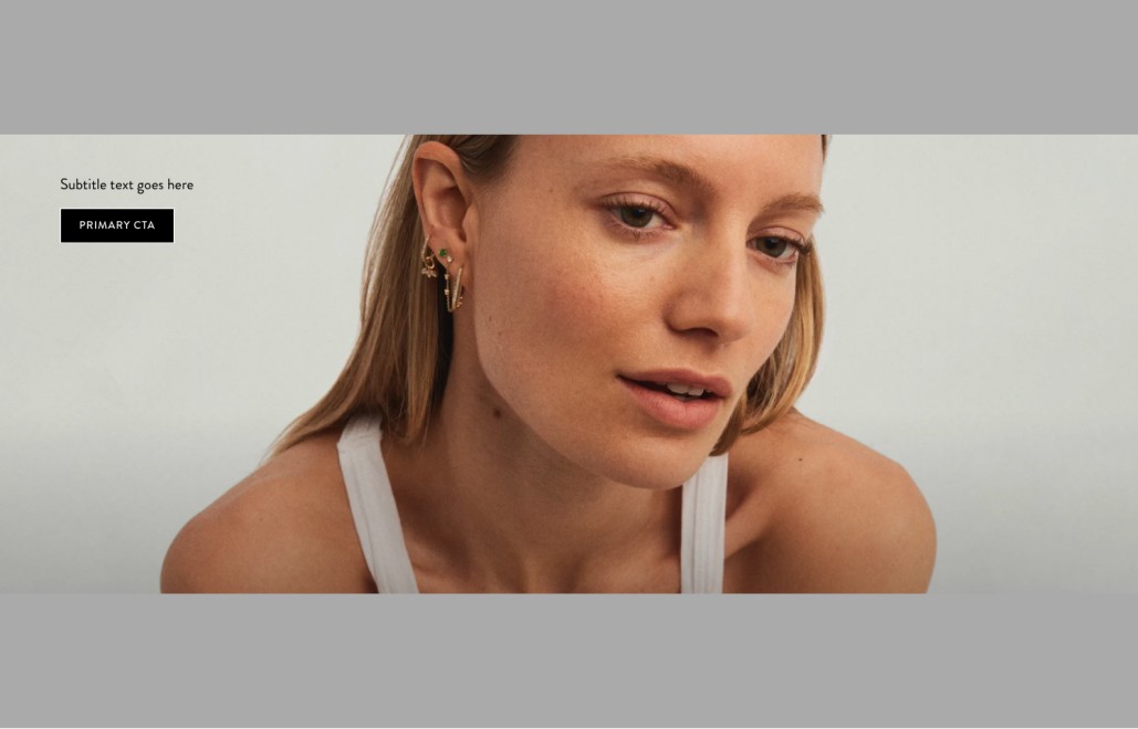
Primary Black BG
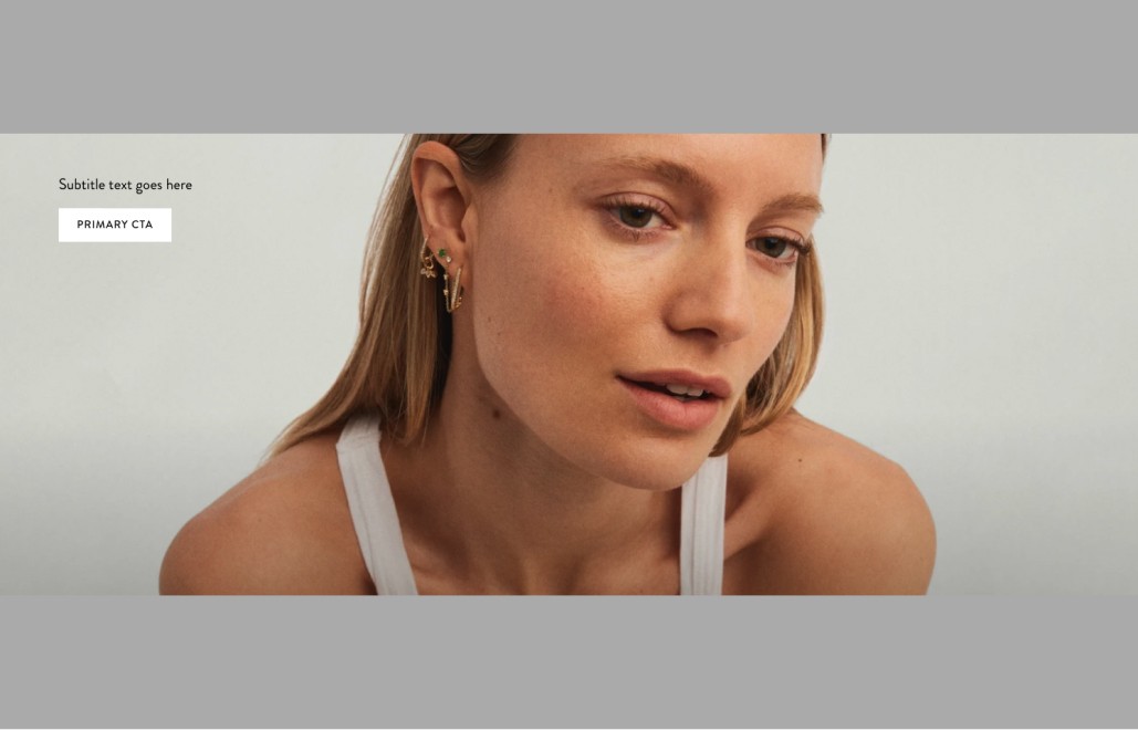
Primary White BG
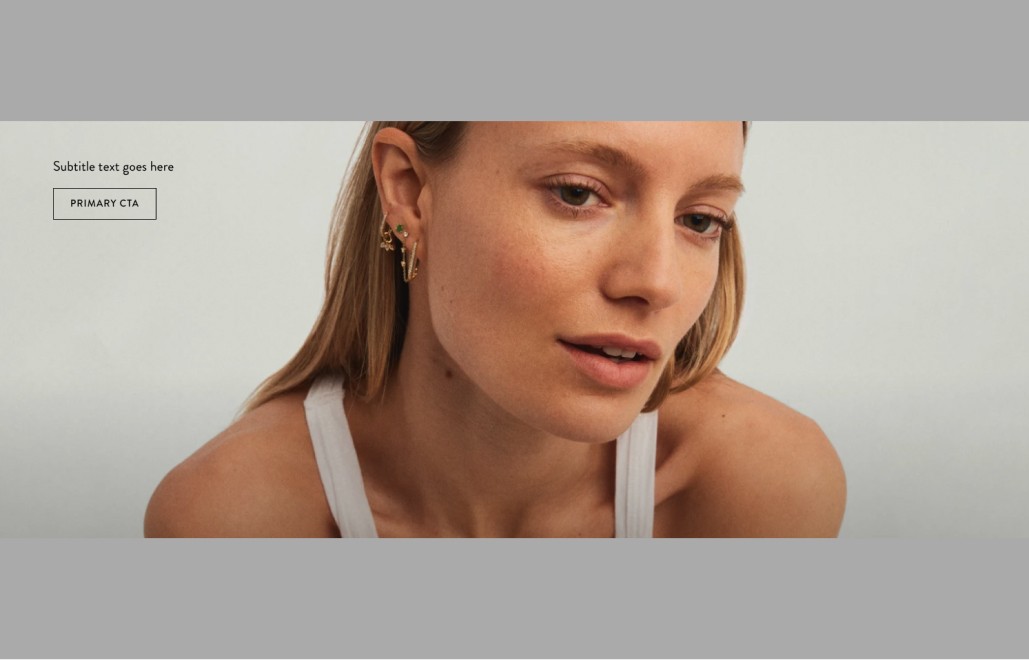
Primary Inverse
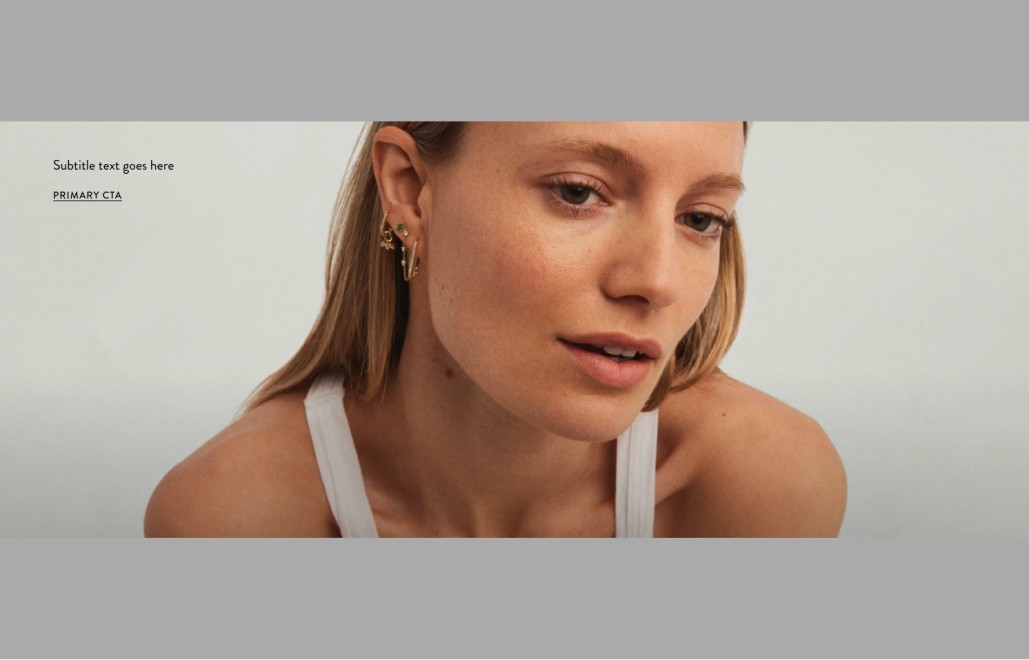
Primary Link

Secondary Link
