Content Cards
Types of content cards
Each types of cards have different layouts and can be displayed in grid or carousel.
- •
Vertical content card (without text, text over image)
- •
Horizontal content card (without text, text over image)
- •
Content card with text (text on top, text at bottom)
- •
Inline card
- •
Text Only
Grid layout
Each types of cards layout can be in grid or carousel. Here are number of cards can be used in grid and carousel layout.
- •Supported Cards: You can display 2, 3, or 4 cards in both desktop and mobile views.
- •Odd Number of Cards: For layouts with 3 cards, the cards can be stacked to maintain visual balance.
Carousel layout
- •Supported Cards: You can display 2, 3, 4, or 5 cards in both desktop and mobile views.
- •Mobile View: On mobile, the carousel layout behaves the same as on desktop, allowing users to swipe through the cards horizontally.
Spacing
- •None
- •Default
- •Loose
Characteristics
- •Basic - This card type will display images or videos without a Shop the look button. This card allow for an image
- •
Shoppable - The shoppable card will allow the user to shop the content shown within the card. The shop the look (STL) button is applied and when interacted with, a modal will be triggered with shoppable products displayed.
- •
Video - The Video content card is the same as the basic card however basic video controls are displayed (pause/play)
- •
Inset Card - The inset card has an image inset within a card shown with text to the right or left of the image.
- •
Text Card - The Content Card Can be used as text only.
- •
Various Spacing- The Content Card offer various column and row spacing (None, Default, Loose)
Note:
Video STL is not currently supported
Vertical Content Cards
Vertical Content Cards has following layouts
- •
Without text
- •
Text over the image
- •
Text on top of the image
- •
Text at the bottom of image
Vertical Cards - Grid, No Text, 2 Cards

Vertical Cards - Grid, No Text, 3 Cards

Vertical Cards - Grid, No Text, 4 Cards


Vertical Cards - Carousel, No Text, 2 Cards
Vertical Cards - Carousel, No Text, 3 Cards
Vertical Cards - Carousel, No Text, 4 Cards
Vertical Cards - Carousel, No Text, 5 Cards
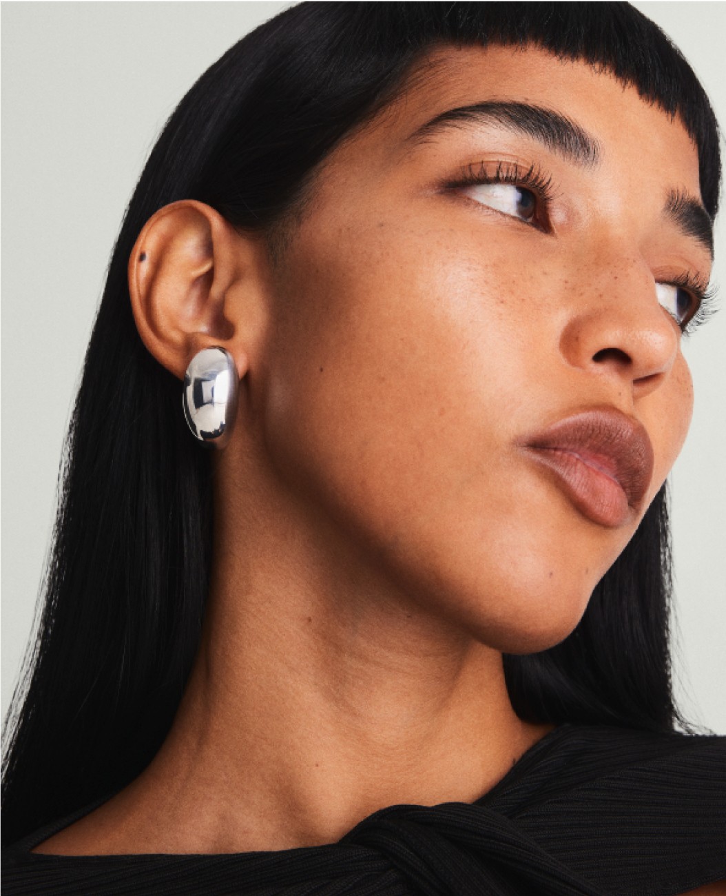
Horizontal Cards
Horizontal Cards Carousel
The inline card can be used with an image
The inline card can be used as 1 column up to 5 columns
The inline card can be used with a video and can span full width.
Text Only with background colour and without.
eyebrow
Display
This is a Title
Small Title
Lorem ipsum dolor sit amet, consectetur adipiscing elit, sed do eiusmod tempor incididunt ut labore et dolore magna aliqua. Ut enim ad minim veniam, quis nostrud exercitation ullamco laboris nisi ut aliquip ex ea commodo consequat.
eyebrow
Display
This is a Title
Small Title
Lorem ipsum dolor sit amet, consectetur adipiscing elit, sed do eiusmod tempor incididunt ut labore et dolore magna aliqua. Ut enim ad minim veniam, quis nostrud exercitation ullamco laboris nisi ut aliquip ex ea commodo consequat.
eyebrow
Display
This is a Title
Small Title
Lorem ipsum dolor sit amet, consectetur adipiscing elit, sed do eiusmod tempor incididunt ut labore et dolore magna aliqua. Ut enim ad minim veniam, quis nostrud exercitation ullamco laboris nisi ut aliquip ex ea commodo consequat.
Content Card with heading over image
The content cards can be displayed with text overlay.
Note:
The Basic Content Card has slightly larger text (to be improved). The Text also does not scale when responsive and may run over the text box area.
Only this 1 typeface & text weight can be applied to each card.
Video Content Tiles do not currently support text overlay.


Content cards can be displayed with text.
The text can appear above or below the image.
There are a variety of text treatments from the design system fonts that can be applied to create your desired look. Backgrounds can be applied behind text.
Eyebrow
Display
Title Copy Goes Here
Small Title Copy Goes here
You can use a variety of different text here.
Lorem ipsum dolor sit amet, consectetur adipiscing elit, sed do eiusmod tempor incididunt ut labore et dolore magna aliqua.
Like this
Or this

Eyebrow
Display
Title
Lorem ipsum dolor sit amet, consectetur adipiscing elit, sed do eiusmod tempor incididunt ut labore et dolore magna aliqua. Ut enim ad minim veniam, quis nostrud exercitation ullamco laboris nisi ut aliquip ex ea commodo consequat.
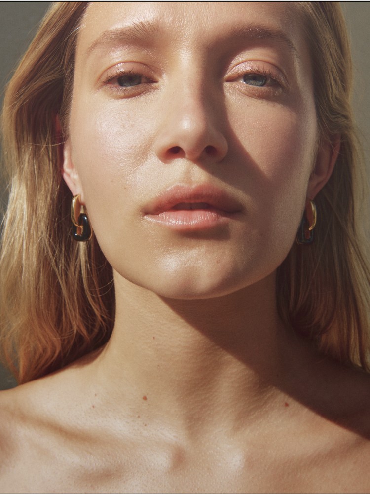
Eyebrow
Display
Title
Lorem ipsum dolor sit amet, consectetur adipiscing elit, sed do eiusmod tempor incididunt ut labore et dolore magna aliqua. Ut enim ad minim veniam, quis nostrud exercitation ullamco laboris nisi ut aliquip ex ea commodo consequat.
Content Cards with text above image
Horizontal Spacing
Horizontal Container spacing= default
Column spacing = default
Layout= grid
Horizontal Container spacing= default
Column spacing = none
Columns=4
Layout= grid


Horizontal Container spacing= default
Column spacing = Loose
Columns=5
Layout= grid


Horizontal Container spacing= default
Column spacing = Default
Columns=3
Layout= grid
Mixed Cards

"Lorem ipsum dolor sit amet, consectetur adipiscing elit, sed do eiusmod tempor incididunt ut labore et dolore magna aliqua. Ut enim ad minim veniam, quis nostrud exercitation"
Horizontal Container spacing= default
Column spacing = Loose
Columns=2
Layout= grid
Mixed Cards
Eyebrow
Display
Title
Small Title
Description. Lorem ipsum dolor sit amet, consectetur adipiscing elit, sed do eiusmod tempor incididunt ut labore et dolore magna aliqua. Ut enim ad minim veniam, quis nostrud exercitation ullamco laboris nisi ut aliquip ex ea commodo consequat. Duis aute irure dolor in reprehenderit in voluptate velit esse cillum
Horizontal Container spacing= default
Column spacing = Loose
Columns=3
Layout= grid
Mixed Cards
Display
Description. Lorem ipsum dolor sit amet, consectetur adipiscing elit, sed do eiusmod tempor incididunt ut labore et dolore magna aliqua. Ut enim ad minim veniam, quis nostrud exercitation ullamco laboris nisi ut aliquip ex ea commodo consequat. Duis aute irure dolor in reprehenderit in voluptate velit esse cillum
The grid can support up to 5 columns on desktop and 3 on mobile

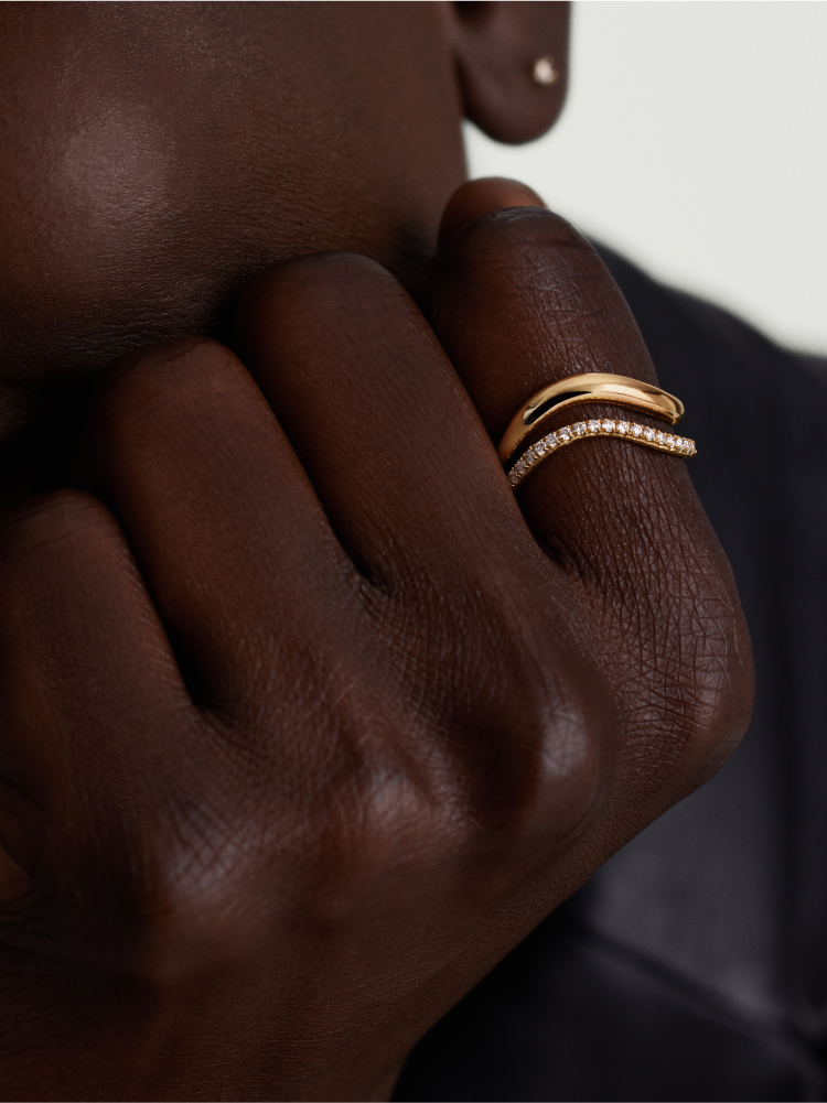
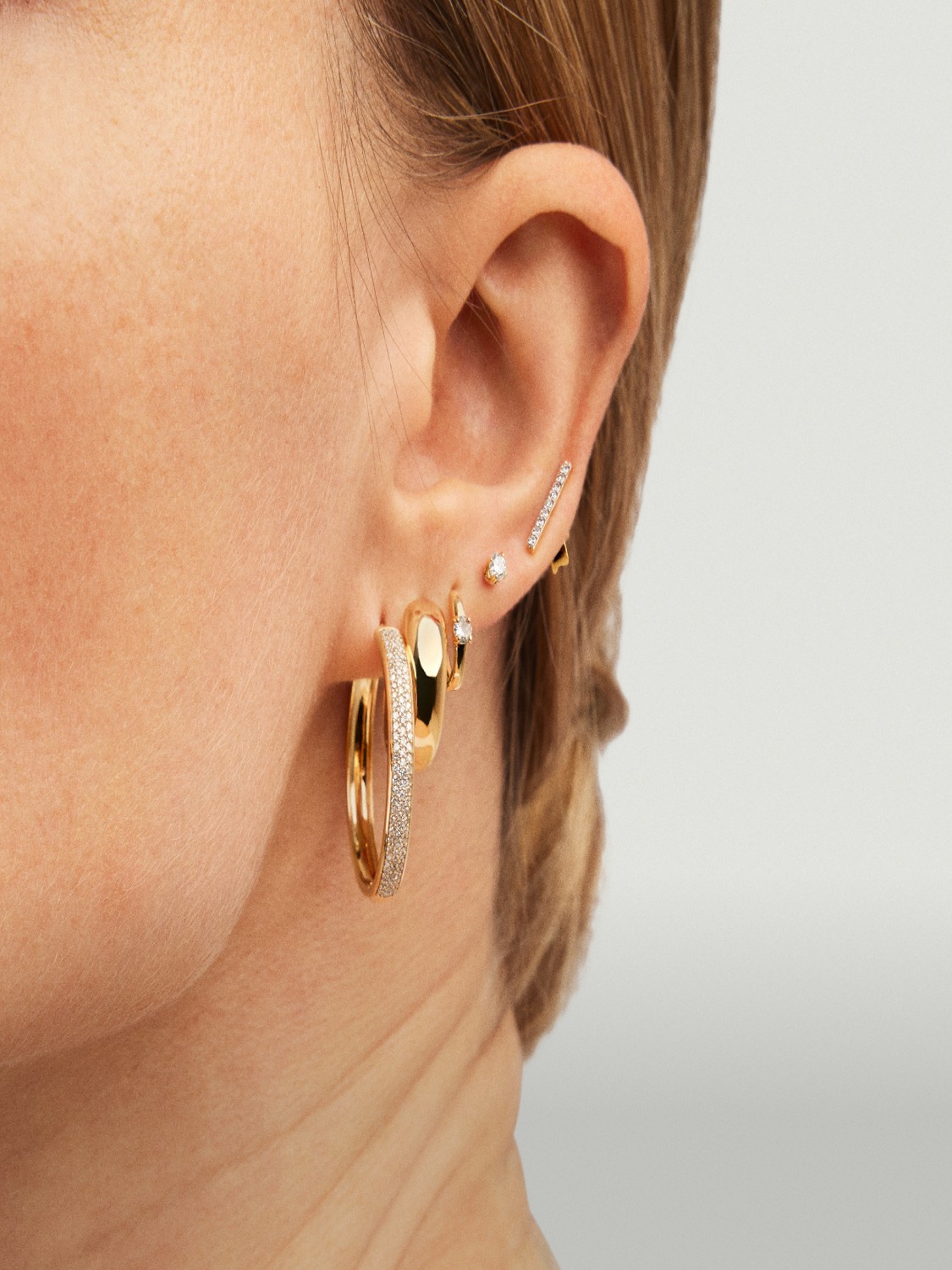


Can be displayed as a carousel with up to 5 columns. All vertical and horizontal padding can be removed. The carousel can bleed of both ends of the page or have padding as shown here.
Can be displayed as a carousel with up to 5 columns. All vertical and horizontal padding can be removed. The carousel can bleed of both ends of the page or have padding as shown here.
