Product Card - Without Variation
Lorem Ipsum
Product Card
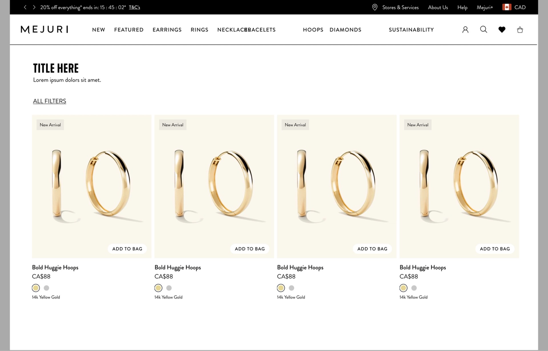
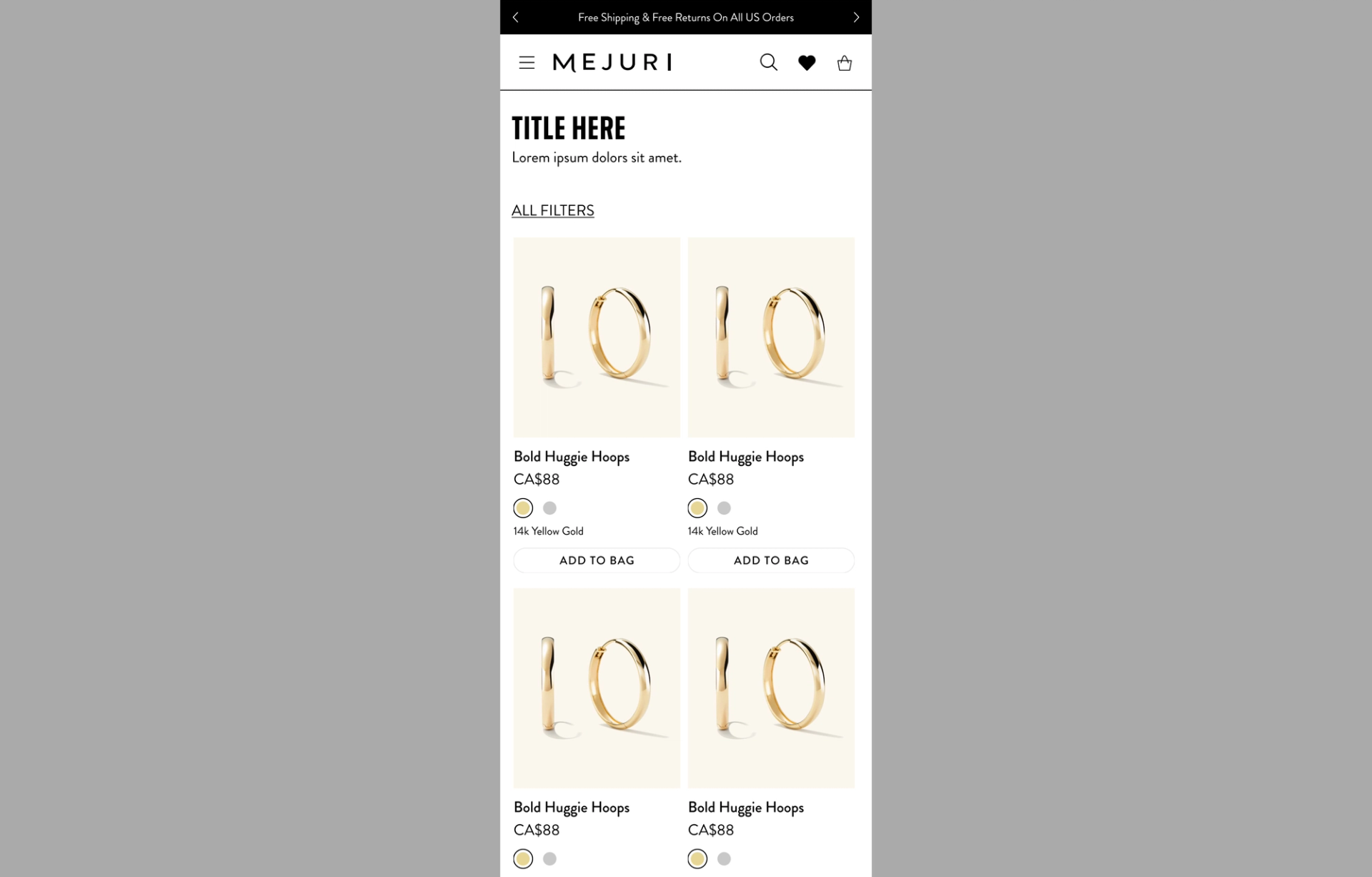
The product card image offer valuable information can help customer understand the product quickly.
- •Best Seller
- •New Arrival
- •Wishlist
- •Shop the look
- •Image Carousel
Also there is 'Add to Bag' CTA on top of the image.
The product cards can be used showcasing various products. Each product card content offer following information and interaction.
- •Product Title
- •Product Price
- •Product Variation selector such as colours, different sizes, birthstone
- •Product Materials or Type
Product Card Layout can be in Grid or Carousel.
Product Card - Grid ( Product Landing Page )
Product Card- Desktop, 2 Cards, Grid
Text Alignment - Left
Usage- Product Landing Page
Product Card- Desktop, 4 Cards, Grid
Text Alignment - Left
Usage- Product Landing Page
Product Card - Carousel (Product Category)
Product Card Carousel can be used for showcasing a categorized group of products such as
- •
Trending jewelry
- •
Best sellers
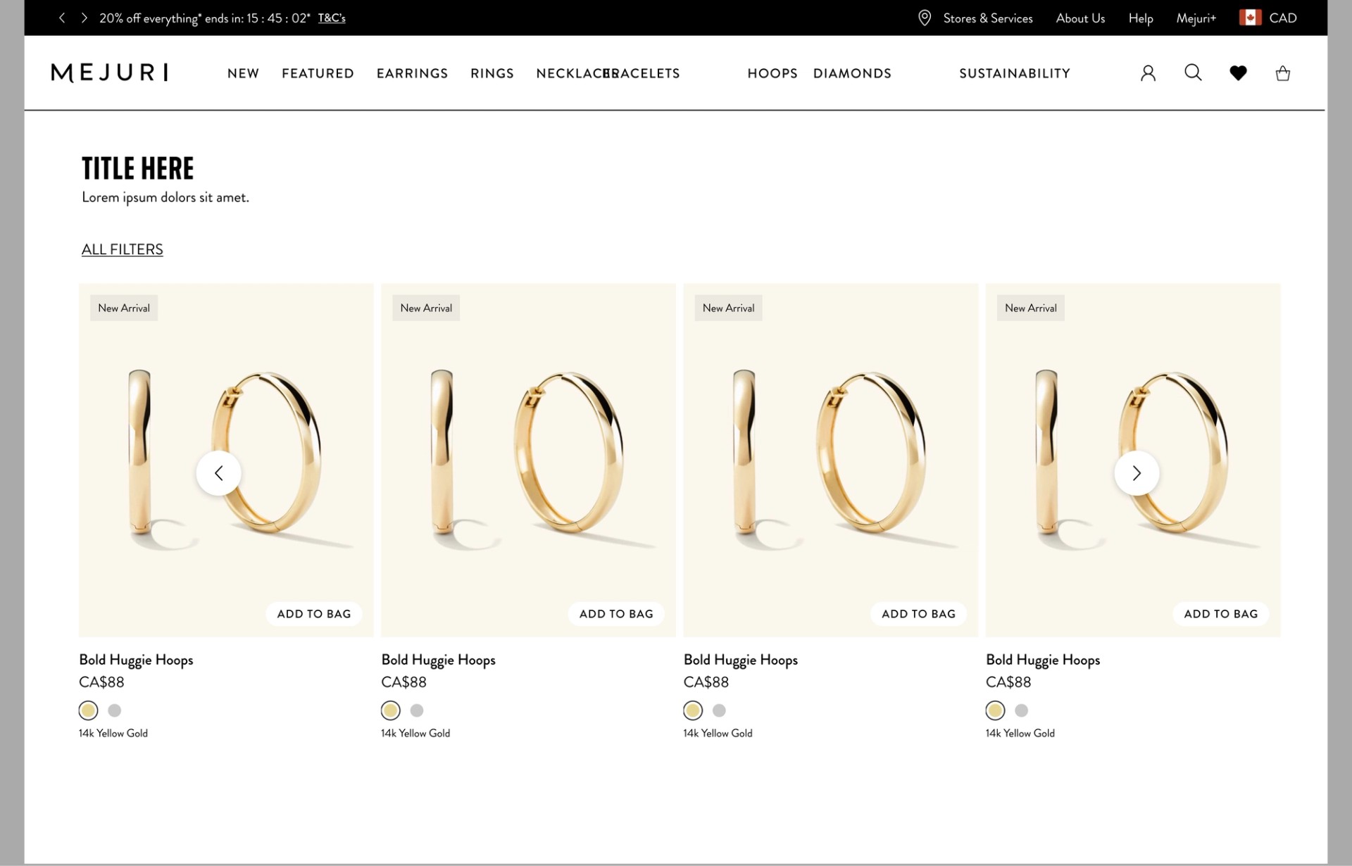
Product Card- Desktop, 4 Cards, Carousel
Text Alignment - Left
Usage- Product Category
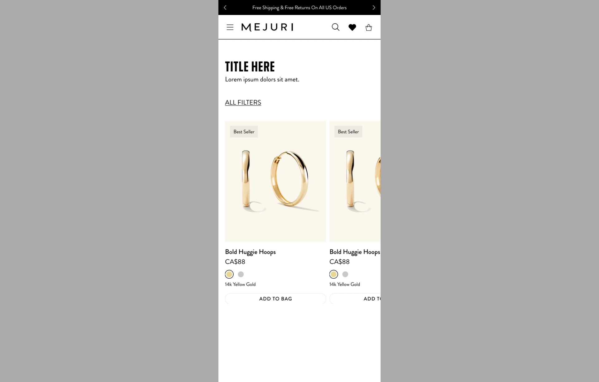
Product Card- Mobile, 1 Cards + Sneak Peek, Carousel
Text Alignment - Left
Usage- Product Category
Product Card (Style With)
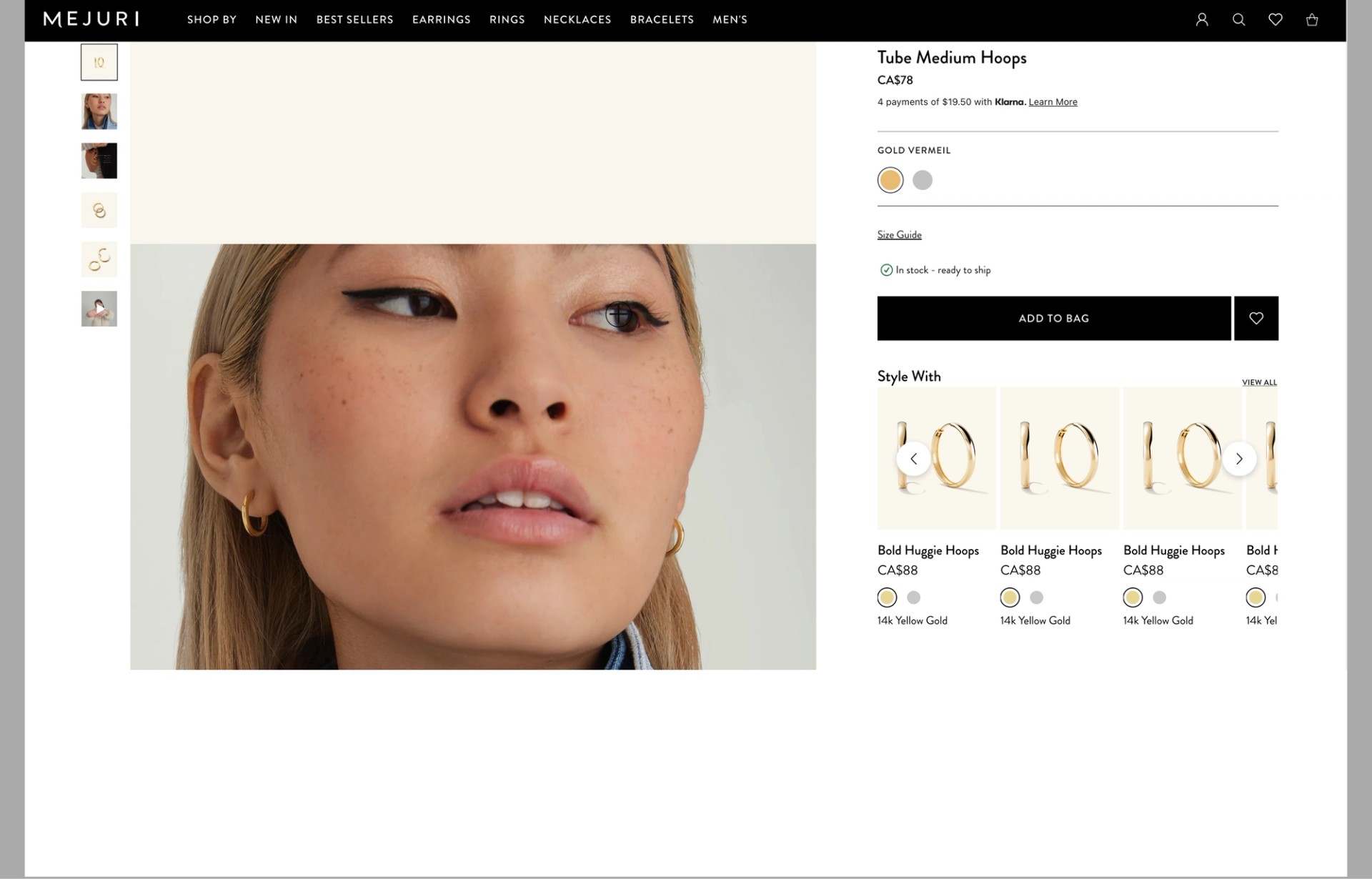
Product Card- Desktop, 3 Cards + Sneak Peek, Carousel
Text Alignment - Left
Usage- Style With on PDP
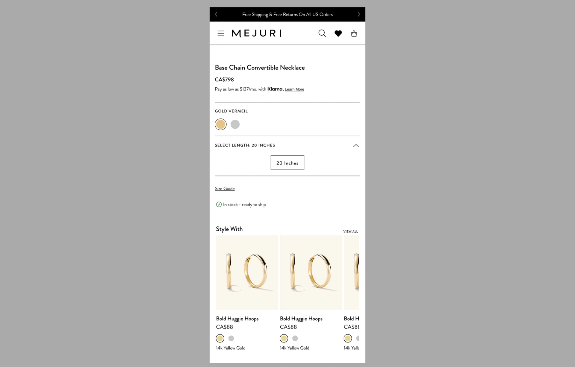
Product Card- Mobile, 2 Cards + Sneak Peek, Carousel
Text Alignment - Left
Usage- Style With on PDP
Product Card (Shop The Look)
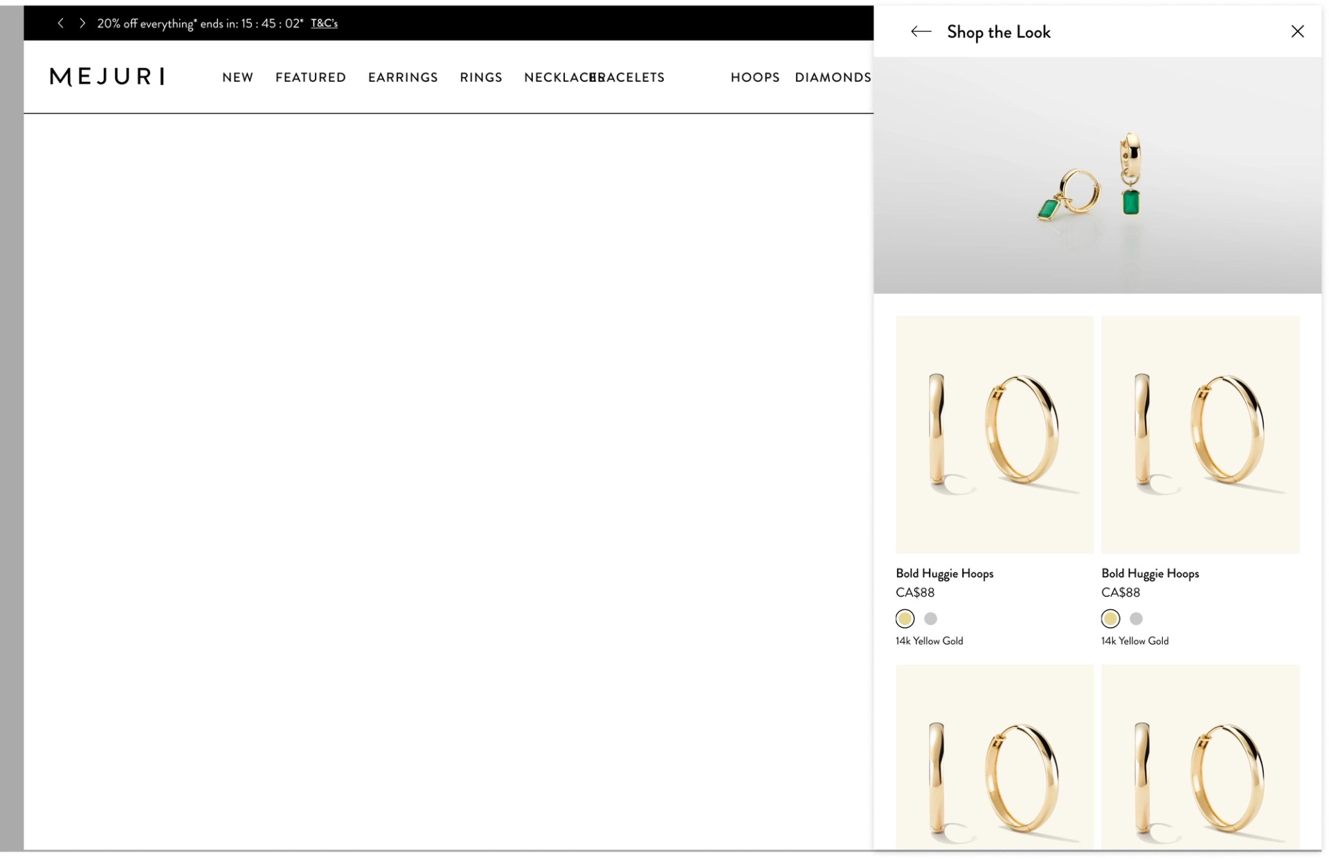
Product Card- Desktop, 2 Cards, Grid
Text Alignment - Left
Usage- Shop The Look CTA Pop Up (Drawer)
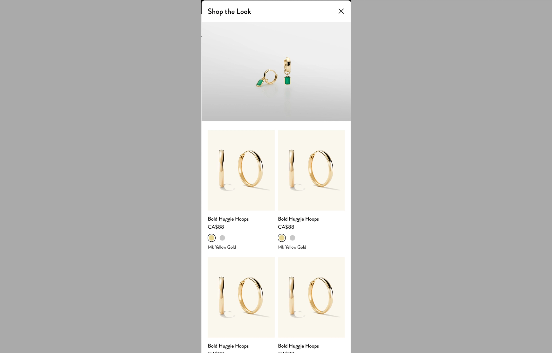
Product Card- Desktop, 2 Cards, Grid
Text Alignment - Left
Usage- Shop The Look CTA Pop Up (Drawer)


